🪰 Have You Noticed Every House in Movies Looks Like an Airbnb Now?
THE BUZZ
- Hollywood cleaned the life out of its houses
- Perfect countertops are starting to look really suspicious
- Somehow, fake clutter used to feel real
I’ve apparently developed a new problem while watching movies and TV.
I look at people’s houses.
And no, not in the normal “oh, hey, nice kitchen” way. I’ve started looking around the room wondering where these people keep their mail or their everyday junk. And where’s the weird decorative bowl somebody’s aunt gave them back in ’07 that they hate but haven’t thrown away?
Because once somebody pointed this stuff out, I couldn’t stop seeing it. A lot of modern movie and television homes don’t look like homes anymore.
They look like Airbnbs…
Everything is boring and tasteful and coordinates perfectly. The countertop always has exactly one expensive-looking object placed three feet from another expensive-looking object. Even when a character is supposedly messy, the “mess” looks like somebody from the art department gently placed a soda can beside a magazine and then backed away slowly… very slowly.
And now I’m obsessed with figuring out what happened to realism and why everything is so fake and staged in this really “meh” and sterile way.
Watch this, and then we’ll talk more…
@jasonkpargin
That video is what hooked me. And it’s not because every old movie set was super realistic or every new one is totally sterile, but because the second you start comparing them, you really do notice how much actual life used to be packed into the background of movies and how much of that is lacking these days.
When Movie Houses Actually Looked Like Somebody Lived There
Let’s take a look back at some movie houses that had real soul.
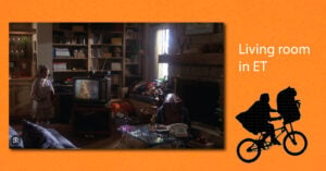
E.T. living room
Look at this living room. Books everywhere. A television shoved where it fits, sorta. A phone sitting on the table. Pillows that weren’t purchased as a coordinated “pillow story.” There’s barely a clean visual line anywhere, yet your brain immediately accepts that a family has been occupying this space for years.
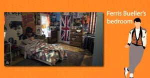
Ferris Bueller’s bedroom
Ferris’s bedroom practically gives you his biography without anybody saying a single word. We’ve got music, posters, flags, electronics, mismatched furniture, and stuff on nearly every surface that tells you what this kid likes, where he’s been, and what he thinks is cool.
It doesn’t look decorated. It looks accumulated, and that’s the key.
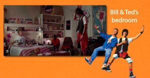
Bill & Ted’s bedroom
There are books, signs, random objects, posters, clothes, and whatever else these guys dragged home and decided belonged in the room. Somebody designing a “teen bedroom aesthetic” would edit 90 percent of this and make it look like you could rent it for 90 bucks a night.
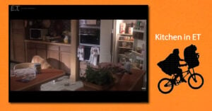
E.T. kitchen
This one may be my favorite because almost nothing in it is trying to be attractive. There’s stuff on the table. Stuff on the counters. Stuff inside the open refrigerator. Towels hanging from the oven. The kitchen looks like everybody left five minutes ago and will be back in ten.
You can almost hear somebody yelling from another room, “Close the damn fridge!”
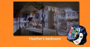
Heather’s bedroom
Even the more deliberately feminine bedroom in Heathers is really layered. Fabric, curtains, stuffed animals, pictures, furniture, and personal objects overlap instead of sitting politely in their assigned places like little design soldiers.
The room belongs to somebody.
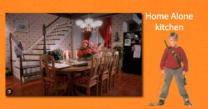
Home Alone kitchen
The McCallister house is obviously a nice house, but look at how much stuff the set allows into the frame.
You’ve got the wallpaper, curtains, plants, refrigerator magnets, and papers on the table. A backpack hanging from the stairs. Oh, and those chairs with patterned cushions.
It’s upscale without looking like it’s waiting for an “open house” sign on the front lawn.
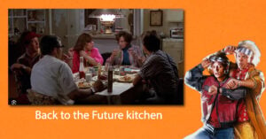
Back to the Future kitchen
This kitchen has the same magic as Kevin’s. There’s food on the table, appliances sitting around, things behind people, things beside people, and visual noise everywhere.
Nothing is screaming for our attention, but together all those ordinary objects convince us this family existed before the scene started.
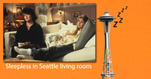
Sleepless in Seattle living room
And then there’s this one… a perfectly nice living room that still contains lamps, flowers, art, curtains, side tables, pillows, and furniture that didn’t all arrive on the same truck.
It feels comfortable, not curated.
Maybe “Lived-In” Is the Thing We Lost
The common denominator isn’t clutter for clutter’s sake, right… it’s history.
These soulful rooms look like objects entered them at different moments. Somebody bought that lamp first, and the chair came later. A kid brought home the poster, and Grandma probably gave them something hideous that stayed anyway. Books were read and stacked instead of selected because their spines matched or their cover matched your color scheme.
Real houses develop layers because human beings are layered.
An Airbnb has the opposite job. It has to appeal to everybody, offend nobody, and contain as little personal history as possible.
And somehow, more and more fictional homes have started giving me that soulless vibe. I was watching some Netflix movie about a family recently, and their kitchen looked like nobody had ever actually used it. The counters were clean as a whistle, with no clutter, no smudges, and not a single piece of wacky first-grade artwork stuck to the fridge.
So What the Hell Happened?
At first, the answer seems obvious: minimalism, right? The “modern” look, which so many people have a love/hate relationship with.
But set designers have always had tricks for making a location feel as though life is happening there.
1. Use Already Old Materials
If you want to make a location feel well-loved, fill it with older items. You can collect discarded items from locals or go thrifting to find these belongings. Aside from giving them additional use, you’re collecting deals and possible keepsakes in the long run.
Remember to choose items at your own discretion, especially while on a limited budget. Just because a furniture piece looks like it’s got some wear and tear doesn’t mean that it’ll be instantly great for the set. Think about the scene and compare your options.
2. Showcase Photos Naturally
The most homey spaces usually have photos on display. And in filmmaking, it’s one of the easiest ways you can provide a visual story about a character’s background. Remember to frame and place the photos throughout the spaces.
Try to consider how the character would showcase the photos as well. For instance, you can hang frameless prints with clothespins on strings to bring life to the room for people who exhibit whimsy. Bonus points if you use string lights, since these offer additional, ambient lighting.
3. Antique the Mirrors
If you have any newer items that look way too new, consider aging them up with the power of antiquing. For instance, mirrors are more known for their ability to create the illusion of a larger space, but you can also tweak their appearance to achieve a more vintage look.
To do this, add paint stripper on the back to scrape off the coating. From there, spray on bleach and water on the back, preferably focusing more on the edges. This will create dark spots in the actual mirror that would mimic aging.
That’s manufacturing history, and I dig the effort. The worn furniture, family photos, and imperfect objects aren’t supposed to jump off the screen. Their job is to make it feel as though a life has already been unfolding in that room for years.
Which brings me to my new favorite piece of filmmaking vocabulary that I just discovered when I jumped down this rabbit hole…
Apparently, All That Crap Has a Name
It’s called Gak.
And once you know what Gak is, a whole lot of those older movie sets start making sense.
This guy digs into all those background objects that fill out a location and figures out why they matter and explains how much thought goes into stuff most viewers will never even notice.
So, yeah, Gak is basically all the nondescript stuff used to fill out a background and make it believable: binders, folders, lamps, calendars, notices, photos, sticky notes, papers, and whatever else would naturally accumulate in that particular place.
The funny thing is that most of it is supposed to disappear. You’re not supposed to stare at every binder on a shelf or inspect every piece of paper stuck to a wall. Your brain just registers that those things belong there. The room feels right because enough ordinary stuff has been layered into it to resemble the real world.
That’s why Ferris’s bedroom works so well. His stuff isn’t just filling space. It reflects who he is.
The same goes for the McCallister kitchen, Heather’s bedroom, and the house in E.T. Every random object becomes a tiny piece of evidence that somebody existed there before we arrived.
The filmmakers behind the Gak explainer make that point… They say backgrounds are supposed to establish mood, place, and character without demanding attention, and the amount of stuff required can be a lot more than you’d think.
We Didn’t Just Lose the Clutter
There’s another piece of this that might explain why those newer spaces can feel so different even when the set isn’t empty or totally “soulless.”
And that’s because the entire visual language of movies has changed.
We used to get warmer lighting, richer colors, and more stylized interiors. If they use that nostalgic warm lighting today, you might think they had no budget, or the quality is subpar.
Over the past few years, social media has become flooded with comparisons between older movies and newer ones. People often point to films from the 1990s and early 2000s and argue that movies simply “looked better” back then. Warmer lighting, richer colors, softer highlights, and more stylized cinematography are frequently contrasted against the cooler, flatter, more muted appearance of many modern productions.
One film that has recently reignited this discussion is The Devil Wears Prada. With conversations surrounding its sequel, audiences are once again seeing just how much visual aesthetics have changed in twenty years. The original film feels glossy, colorful, warm, and heightened. By comparison, many contemporary films and streaming series lean heavily into desaturated palettes, softer contrast, naturalistic lighting, and subdued production design. For many viewers, modern productions feel dull, lifeless, or visually sterile.
But why did this shift happen?
Part of the answer comes down to changing artistic preferences. Cinematography trends evolve the same way architecture, fashion, interior design, and graphic design evolve. Modern aesthetics across nearly every industry currently lean toward minimalism and realism. We see it in gray interiors, neutral clothing palettes, clean corporate branding, and photorealistic video games. Across culture as a whole, there has been a growing preference for things that feel grounded, understated, and emotionally authentic.
Because of this, heavily stylized lighting techniques that once defined mainstream films can now feel artificial to modern audiences. The warm glows, polished glamour, and dramatic backlights common in early 2000s cinema may now remind viewers of Hallmark movies, daytime television, or lower-budget productions. In response, filmmakers increasingly moved toward imagery that feels observational rather than theatrical — as though the camera is simply capturing reality instead of enhancing it.

These days the set design trend is quieter but brighter and more restrained. Part of the reason may be that set design and interior design overlap so heavily. Many of the people creating these spaces are working within the same design trends they may also be helping to shape.
Set design and interior design are interlinked
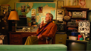
It’s not uncommon for someone who works in set design to have interior design skills, so perhaps it’s no surprise that there is a lot of overlap. Some of the best loved films of our time have had a big influence when it comes to interior design trends, from Star Wars to Breakfast at Tiffany’s and James Bond. However, it’s perhaps the Wes Anderson films that have had the biggest impact when it comes to influencing interior design trends.Inspiration via the treatment of colour
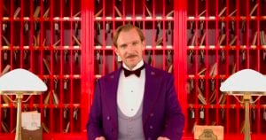
There are some films where the way that colour is used in set design sparks immediate interior design trends because it’s just so distinctive. Wes Anderson films have become renowned for this – The Grand Budapest Hotel and The Royal Tenenbaums in particular. The Grand Budapest Hotel actually received an Oscar for its set design, which is no surprise because it was truly distinctive and delicious. Candy coloured hues and sepia tones added to the sense of eclecticism and drama in the film. They were also used to highlight key details, such as a marsala red or a bright pink to draw the eye of the viewer where the director wanted it to go.Statement walls
The Royal Tenenbaums also used colour to provide a strong visual language for the film but it was the wallpaper that created its own unique interior design trend. Throughout the film there are many walls that are papered in Scalamandre zebra print wallpaper. After the film was released this wallpaper was replicated by many design companies and across many design schemes. Its motifs also made their way into a range of interior products and soft furnishings.
The colors in Wes Craven’s two movies mentioned above were truly stunning.
Maybe the Airbnb Look Isn’t Just Hollywood’s Problem
Which raises the question I keep coming back to after digging into all of this:
Do people actually live this way now?
Maybe some do. Maybe the cleaner, quieter, more minimal interiors showing up on screen really are reflecting what people want their homes to look like these days.
Still, the Airbnb comparison feels weirdly perfect because an Airbnb has to resemble a home without carrying any evidence of life.
It needs enough personality to feel sorta welcoming, but not so much that somebody else can’t imagine themselves staying there… and that’s kinda sad to me.
It’s pretty much the exact opposite of Ferris Bueller’s bedroom.
You could never mistake that room for anybody else’s.
The same goes for the McCallister kitchen, the house in E.T., or the bedroom in Heathers. Those spaces don’t just provide somewhere for the actors to stand. They tell us who’s been living there, what kind of people they are, how long they’ve been around, and what they’ve accumulated along the way.
When all of that disappears, the actors are just standing inside something that feels less like a location.
And once you start noticing all this, those suspiciously spotless countertops are really hard to ignore.
THE LANDING
The best movie homes make you believe somebody was living there long before the camera showed up.
STAY CURIOUS
Three more stories worth your curiosity.

 We Should Be Living Like the Jetsons



Post Comment