🪰 Did the World Lose Its Color, or Are We Just in Our Beige Era?
THE BUZZ
-
When did buying a red toaster become a bold personal statement?
-
Grandma’s orange kitchen may have been onto something.
-
Our living rooms are starting to match our oatmeal.
We’ve all seen the living rooms that are so “neutral” and so carefully coordinated that just a bowl of oranges or a rogue tissue box sticks out like a sore thumb. Nowadays, the ultimate interior style is for everything to be neat, tidy, and neutral. Essentially, it should look like basically no one lives in the home. That’s the goal.
Honestly, it’s not the worst aesthetic, especially when you compare it to the chaotic, cluttered spaces we had in the 80s, 90s, and early 2000s.
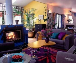
Just a few decades ago, our interior spaces were filled with all kinds of color, contrast, varying shapes, and a whole spectrum of styles from various decades. It was a tad chaotic, so it’s sort of understandable why now we strive for spaces that look more like this:
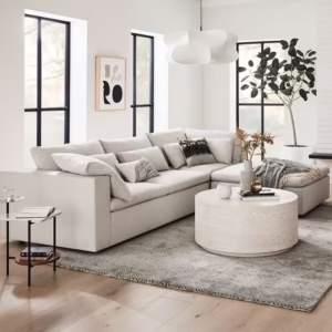
You can clearly see the contrast here: in the 90s living room everything is bold, cluttered, and lived-in. But the 2020s-style living room brings neutrality, order, and an overall sense of serenity.
This effort to bring organization and neutrality to spaces goes well beyond our living rooms. It’s stretched into branding, clothing, and public spaces all over the world. If it isn’t greige and basic, then it isn’t “modern” or mass appealing.
TikTok creator Shot & Forgot illustrates this shift in the video below, following what he calls “blanding” through familiar logos, technology, fashion, and pop culture. His comparisons give us insight into something many of us aren’t necessarily aware of: the sense that being polished and sophisticated means taking the interesting bits out.
Some of that gray is measurable
Just take a look at a parking lot, any parking lot. Sure, we can joke about struggling to find our gray car among the other gray cars, but there are actual numbers behind this sameness epidemic.

BASF’s report on automotive colors in 2025, published in January 2026, found that gray has gained major popularity globally.
Gray records a significant increase of two percentage points, strengthening its position as a modern-elegant choice. White shows a slight decline, and black remains strong but with fewer solid finishes, as overall solid colors shrink to just 18 percent of the market. This development underscores a global trend that combines timeless elegance with expressive diversity, with green leading the shift toward a more individual and sustainable color palette.
Obviously, these figures concern cars, which is a significant investment where we’re choosing something we may have to live with for years. So it’s easy to understand the temptation to pick a color that we won’t regret five or so years down the line. After all, a bright purple car is a bigger commitment than a bright purple pair of socks.
But still, the recent preferences around neutral car colors gives us a measurable way to see how our current choices reflect sameness as opposed to individuality.
Good taste has changed its outfit before
In eighteenth-century Europe, a wealthy man could advertise his standing through richly colored clothing. Pink could signal money and power, which is quite a contrast to how a successful modern man would wear a fully black or grey Armani suit to portray wealth and sofistication.
View this post on Instagram
The Victoria and Albert Museum traces how materials like dark wool became a status symbol in nineteenth-century menswear. But here’s the curious part: synthetic dyes made brilliant colors more widely available in the 1850s, yet men’s fashions became relatively restrained.
This shows that despite having more colors to choose from, the public still chose to show restraint. Sound familiar?
Before synthetic dyes were developed in the 1850s, colourful clothing was the preserve of the powerful, as dyes were expensive to create. In the mid-19th century, a variety of brilliant hues started to become more widely available, and yet menswear became relatively restrained in this period. By the 1960s and ’70s however, colour had made a comeback. At the time when the Rainbow Flag was created as a symbol of gay pride, from New York’s Greenwich Village to London’s Soho, male peacocks relished the expressive possibilities of colour.
This really shows that what looks appropriate in one period can become exactly what people want to escape in another. It’s really just a case of trends coming and going.
Then the furniture started acting up
Let’s return back to our living room, which is another place where this argument shows up decade after decade.
When the Milan-based Memphis design collective debuted in 1981, its designers challenged current design with plenty of vivid colors, clashing patterns, and furniture that refused to fade politely into the background.
One armchair combined tomato-red upholstery with yellow or blue legs and a pink-and-black print. It’s literally like Rothko and Andy Warhol had a furniture baby.
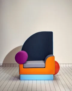
It was an exuberant two-fingered salute to the design establishment after years in which colour and decoration had been taboo.
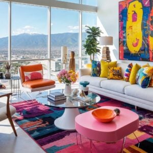
Ya know, this frustration sounds familiar… it’s a lot like the current designers who are rebelling against the “West Elm-style” minimalism with their own loud, color-filled maximalist designs.
Apple has already found the paint again
Apple and the whole Steve Jobs aesthetic definitely played a role with our current greige/minimalist obsession. However, it appears that even Apple is starting to slowly shift the color palette back to something more exciting and expressive.
Just go back a couple decades, and the 1998 Bondi Blue iMac gave us a computer with a translucent blue-green shell. Quite the contrast to grey, streamlined computers they’re rolling out these days.

Then, in April 2021, Apple introduced a redesigned iMac in seven colors, including yellow, orange, pink, and purple. It was a lovely throwback to the iMacs of Apple’s past.

That iMac redesign illustrates something interesting: a product can be both minimal and colorful at the same time. We can both express individual creativity all while remaining slick and modern. It’s a win-win.
Pepsi also has undergone a colorfication makeover, and although it appears in the TikTok video’s discussion of simplified branding, its 2023 redesign deliberately leaned into stronger color and contrast.

An updated color palette introduces electric blue and black to bring contrast, vibrancy, and a contemporary edge to the classic Pepsi color scheme.
A comeback can take the scenic route
Remember that parking lot? The BASF report has another detail worth returning to. In the Americas, the share of colored car paints rose by almost two percentage points in 2025, even as gray increased globally.
And among the shades gaining momentum were green, violet, brown, and, somewhat inconveniently for our headline, beige.
This statistical increase in color doesn’t necessarily mean our streets are about to resemble Mario Kart’s Rainbow Road, but still, it’s an interesting shift.
It’s actually pretty close to how our shifts in taste happen in real time. We don’t necessarily wake up one morning and replace all the boring neutral stuff in our house. I mean, in this economy? Ain’t nobody got money for that… but perhaps we’ll buy a sassy turquoise chair, keep the pale walls, and discover that the room can survive having something in it that doesn’t match.
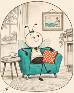
Looking across all of these examples, it’s pretty easy to see that this retreat from color and individualism is less permanent and more of a temporary trend. Just looking through the past, trends in color and design really are just that: trends.
Years from now, we’ll probably look back at these carefully coordinated 2020 interiors and recognize this period immediately. These rooms that we’ve strived to make look “neutral” and “timeless” might end up looking very much like their time. How ironic.
THE LANDING
Someday, a renovation show will tear out all this beige with the same confidence that put it there.
STAY CURIOUS
Three more stories worth your curiosity.






Post Comment